
Plik:Oil Prices Since 1861.svg

Rozmiar pierwotny (Plik SVG, nominalnie 1450 × 414 pikseli, rozmiar pliku: 27 KB)
| Plik Oil Prices Since 1861.svg znajduje się w Wikimedia Commons – repozytorium wolnych zasobów. Dane z jego strony opisu znajdują się poniżej. |
Opis
| Opis |
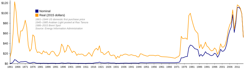
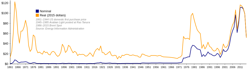
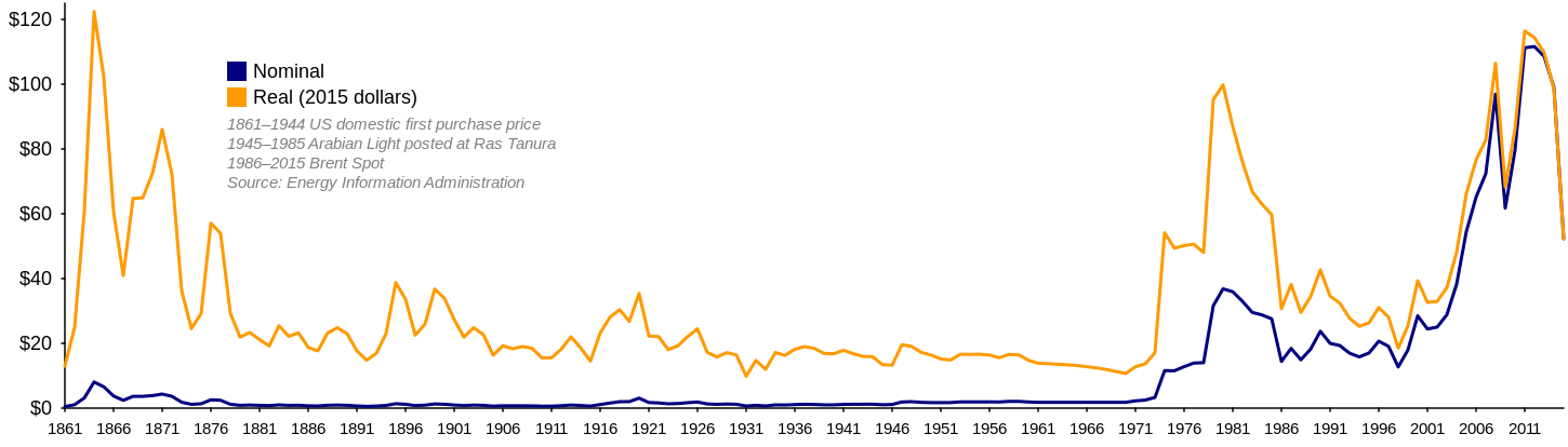
I saw Image:Oil Prices 1861 2006.jpg recently and found it to be very useful. I noticed that it was in JPEG format, and saw that it was based on government sources which are available online, so I decided to recreate it in a lossless image format and update it to 2007. I've been experimenting with SVG lately, so I decided to try that instead of just saving a chart as a PNG. I found that I had to do a good bit of reverse engineering of data, and so I would like to document that here so that this graph can be more easily maintained in the future. I found that the source quoted by the previous image, this spreadsheet from the Energy Information Administration (EIA), only provides data up to 1999 and uses 1999 dollars. It appears to provide conversions to real 1999 dollars using the United States Consumer Price Index (CPI), available from the Bureau of Labor Statistics here. I studied the EIA web site further and noted that the author of the previous image brought the above spreadsheet up to date using the latest Brent Spot prices, available on this spreadsheet, also from the EIA. The update to 2006 dollars also appears to use the CPI. I used the newest version of the above Brent Spot spreadsheet to get prices up to 2007, and converted to 2007 dollars using the latest CPI data. I have thought about how to incorporate 2008 data, but haven't decided how to do it yet. The chart currently uses yearly averages; since 2008's not over yet, we don't have an average price for this year. I have to integrate it in a way that doesn't hurt the accuracy of the graph. I have put further thought into how the EIA's 1861–1999 spreadsheet is constructed, with the intention of possibly improving it. I am not a commodities broker, nor am I an oil man, but I have a few thoughts:
I am not a big fan of how the graph is a composite of three different sources. It sort of seems like an apples and oranges comparison to me. The 1861–1944 data is domestic crude oil first purchase price. The EIA defines "first purchase" this way:
The data from 1945–1985 is, as far as I understand, the price you would have paid for a barrel of light crude if you had dropped anchor at Ras Tanura and said "Load it up!". The price from 1986–present is the price you would have paid if you had gone into the International Petroleum Exchange in London flapping your arms around and shouting (or, starting in 2005, put a message to IntercontinentalExchange into a series of tubes). These all seems subtly different to me. I think it would be better if the entire chart relied on the same source. Oil was not extracted in large quantities in the Middle East until the mid-20th century, and was first drilled in the North Sea in the 1970s, but the EIA has US domestic oil prices from 1859 all the way to today. It has month-by-month prices from 1974. Because the prices are for oil right at the field, they are lower than the market prices we're used to hearing, but they are still real prices and are from a consistent source. I am considering making a version of this graph that uses US domestic first purchase prices exclusively, and uses monthly data from 1974 onward so that we can go all the way to last month instead of waiting for the yearly average. I made a graph that shows monthly Brent spot prices, which is available here. It provides a detailed, recent history. I plan to make some more graphs in the future. |
| Data | |
| Źródło | Praca własna |
| Autor | TomTheHand |
| Inne wersje | Arabic |
Comment by Sammy Finkelman: Maybe for years before 1913 the Wholesale Price Index was used? That has been calculated back to 1749 and was published as far back as 1955 and maybe earlier.
If you do a Google Search for "Wholesale Price Index" 1749, you'll find an article from TIME Magazine from 1959 that discusses this a little bit. The Wholesale Price Index by now has been calculated back to 1720. They use different sources for different years.
Licencja
- Wolno:
- dzielić się – kopiować, rozpowszechniać, odtwarzać i wykonywać utwór
- modyfikować – tworzyć utwory zależne
- Na następujących warunkach:
- uznanie autorstwa – musisz określić autorstwo utworu, podać link do licencji, a także wskazać czy utwór został zmieniony. Możesz to zrobić w każdy rozsądny sposób, o ile nie będzie to sugerować, że licencjodawca popiera Ciebie lub Twoje użycie utworu.
- na tych samych warunkach – Jeśli zmienia się lub przekształca niniejszy utwór, lub tworzy inny na jego podstawie, można rozpowszechniać powstały w ten sposób nowy utwór tylko na podstawie tej samej lub podobnej licencji.

|
Udziela się zgody na kopiowanie, rozpowszechnianie oraz modyfikowanie tego dokumentu zgodnie z warunkami GNU Licencji Wolnej Dokumentacji, w wersji 1.2 lub nowszej opublikowanej przez Free Software Foundation; bez niezmiennych sekcji, bez treści umieszczonych na frontowej lub tylnej stronie okładki. Kopia licencji załączona jest w sekcji zatytułowanej GNU Licencja Wolnej Dokumentacji. |
Historia pliku
Kliknij na datę/czas, aby zobaczyć, jak plik wyglądał w tym czasie.
| Data i czas | Miniatura | Wymiary | Użytkownik | Opis | |
|---|---|---|---|---|---|
| aktualny | 10:18, 28 lut 2016 | 1450 × 414 (27 KB) | Delphi234 | 2015 | |
| 21:13, 1 cze 2015 | 1450 × 414 (27 KB) | Delphi234 | 2013 | ||
| 17:22, 9 mar 2009 | 1396 × 414 (26 KB) | TomTheHand | Ugh, didn't use quite the right data set. Sorry about all the re-uploads. I'm rusty with SVG. | ||
| 17:05, 9 mar 2009 | 1396 × 414 (27 KB) | TomTheHand | Removing the circles at each data point. Seems most common SVG renderers have trouble with them, and don't center them properly. | ||
| 17:02, 9 mar 2009 | 1398 × 414 (27 KB) | TomTheHand | Whoops, updated a reference to 2007 in the graph. | ||
| 16:59, 9 mar 2009 | 1398 × 414 (27 KB) | TomTheHand | Updating for 2008. I sort of regret putting the end year in the file name now ;-) | ||
| 04:45, 14 maj 2008 | 1386 × 414 (29 KB) | TomTheHand | Fixed reversed legend colors | ||
| 06:00, 13 maj 2008 | 1386 × 414 (28 KB) | TomTheHand | == Summary == {{Information |Description=This image is an updated, vector graphics replacement for Image:Oil Prices 1861 2006.jpg. The graph is based primarily on [http://www.eia.doe.gov/pub/international/iealf/BPCrudeOilPrices.xls this spreadsheet] | ||
| 05:00, 13 maj 2008 | 1386 × 414 (28 KB) | TomTheHand | {{Information |Description= |Source=self-made |Date=May 12, 2008 |Author= TomTheHand |Permission= |other_versions= }} This image is an updated, vector graphics replacement for Image:Oil Prices 1861 2006.jpg. The graph is |
Lokalne wykorzystanie pliku
Następujące strony korzystają z tego pliku:
Globalne wykorzystanie pliku
Ten plik jest wykorzystywany także w innych projektach wiki:
- Wykorzystanie na ar.wikipedia.org
- Wykorzystanie na ast.wikipedia.org
- Wykorzystanie na az.wikipedia.org
- Wykorzystanie na ba.wikipedia.org
- Wykorzystanie na ca.wikipedia.org
- Wykorzystanie na cs.wikipedia.org
- Wykorzystanie na cv.wikipedia.org
- Wykorzystanie na cy.wikipedia.org
- Wykorzystanie na da.wikipedia.org
- Wykorzystanie na de.wikipedia.org
- Wykorzystanie na el.wikipedia.org
- Wykorzystanie na en.wikipedia.org
- Indira Gandhi
- 1973 oil crisis
- National Energy Program
- 2000s energy crisis
- Talk:2000s energy crisis
- Alberta separatism
- Energy industry
- Albert Allen Bartlett
- Transportation demand management
- Age of Oil
- Talk:2000s energy crisis/Archive 2
- Talk:Bjørn Lomborg/Archive 3
- Post–World War II economic expansion
- 1970s energy crisis
- Economic policy of the Indira Gandhi government
- Wykorzystanie na eo.wikipedia.org
- Wykorzystanie na es.wikipedia.org
- Wykorzystanie na eu.wikipedia.org
- Wykorzystanie na fa.wikipedia.org
- Wykorzystanie na fiu-vro.wikipedia.org
Pokaż listę globalnego wykorzystania tego pliku.